A quick guide to mixed prints outfit ideas that are easy and eye catching.

Mixing prints did not initially come easy to me. Nor was it obvious which prints I should mix. Before I became able to articulate my style preferences, I heavily relied on matching my clothing items. A pink top was usually paired with pink shoes and pink jewelry. While I still love a matching set, my style has evolve to a place where mixing prints are now completely routine.
Related: Everything You Need To Know Before Purchasing Your Next Matching Set
| I share things I enjoy with all of you. If you happen to buy, I may earn a commission when you use the links in this post (at no cost to you). |

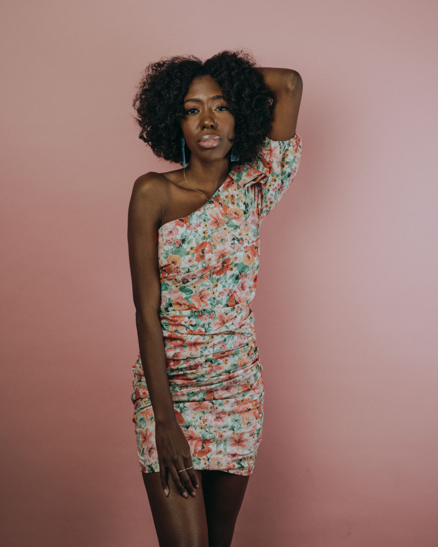
Mixed prints outfit
The fear I had with mixing prints was based on concern the outfit would look uncoordinated and chaotic. In a way, at the core of what you are doing when mixing prints is to bring together two or more varying prints that theoretically don’t go together. How our brains perceive color is important to the beliefs we develop around what works or doesn’t.


The importance of color in data viz
I think a lot about color as someone who has been recently obsessing over data visualization. In data viz, color is employed as a visual cue to help us and our audience interpret the data. By understanding the data and defining the story you plan to tell, we then rely on humans innate ability to associate specific colors with certain meanings or concepts. For example, when we think of green our minds associates that color with positivity, growth or nature. When we see red our minds may go in the opposite direction and think of danger, stop or passion. Depending on the data story I plan tell, I select colors that emphasizes the message and rather than hide it.
Our clothes, just like data, tell a story. As previously mentioned, the color green and red have very different meanings. And yet we see those colors together all the time. How do I decide what prints can “go together”? Breaking free of the mold of matching that initially controlled my style choices has been so freeing. I enjoy my clothes so much more because I am not afraid to mix things up! Trust me you can get a lot out of the pieces in your closet by exploring unconventional pairings. Ahead I share tips that outline how mixed prints can be worn together and even styled seamlessly.

1. Opposites attract
Paring a bold print with a subtle print help keeps your look cohesive. Or if you are going to wear a more vibrant print, you should pair it with something darker. Christopher John Rogers is known for his signature stripes. Pairing the vibrant stripes with black and white animal print served as the perfect contrast.
2. Redefine what you consider neutrals
Animal prints are my go-to. I wear them as neutrals. These prints have been proven to be quite versatile. Start with fashion favorites like leopard, snakeskin or zebra print. As you get comfortable you can add more complex prints to your wardrobe.
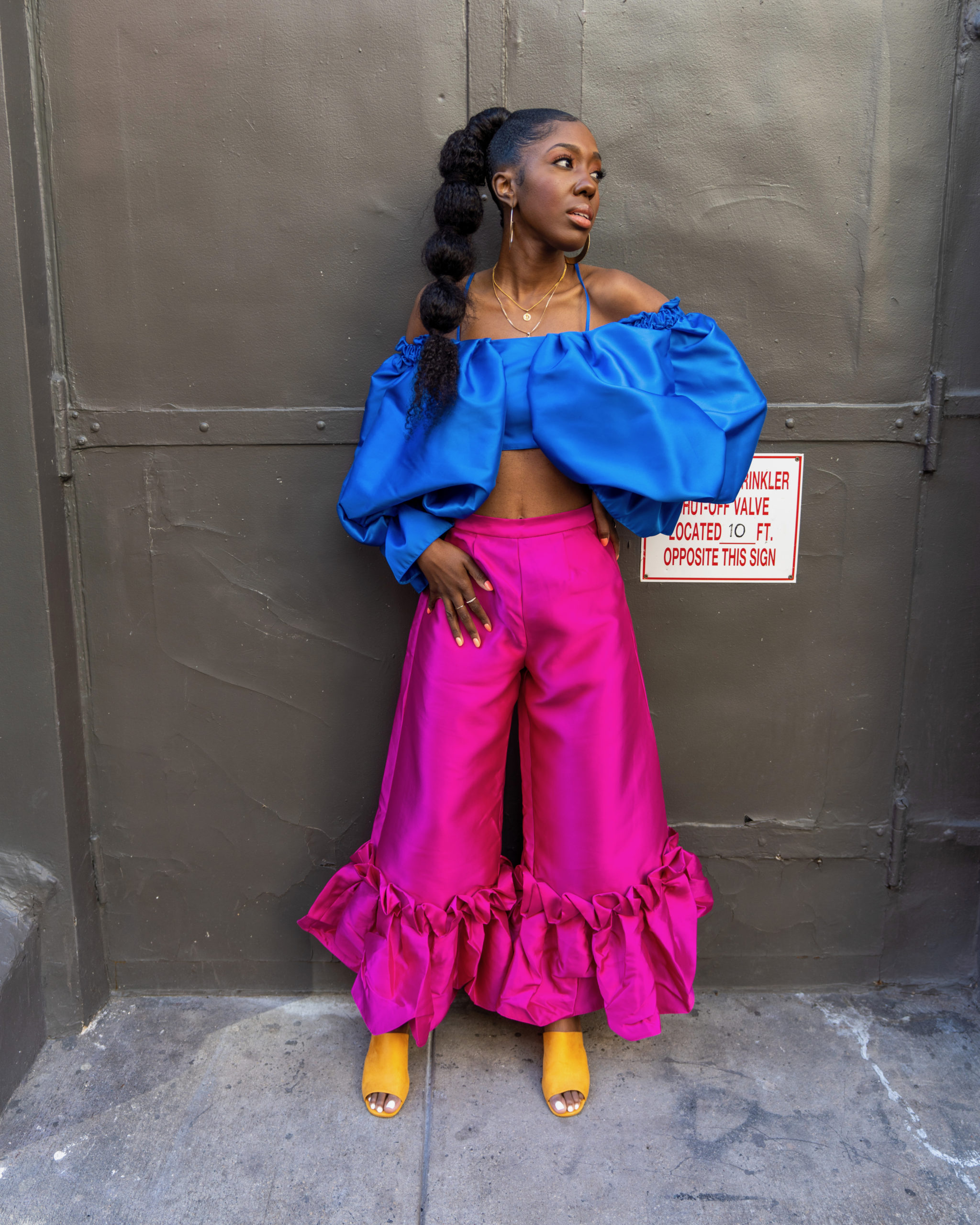
3. Coordinate similar colors
Coordinating color schemes shared among the mixed prints is a great way to start. Try black and white polka dots with black and white stripes. Mixing like colors with different prints creates a visual illusion without any of the headache.


Happy mixing! Let me know in the comments which prints you combine.
Live abundantly,
Bethany